Add a HighlightSection
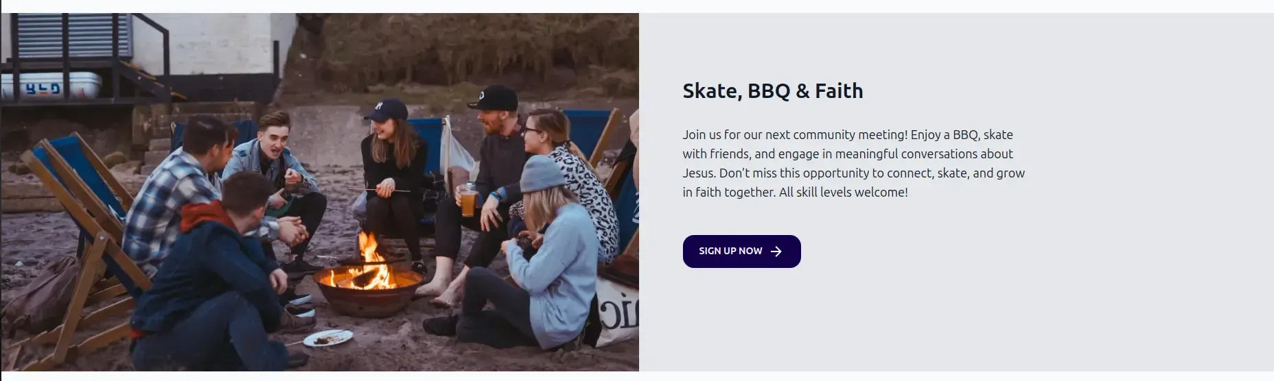
If you have content to highlight, you can use the HighlightSection component. This component displays a large
image with a title, a description, and an optional link to another page.
It already includes a Section component to handle the layout. Here is an example of how to use it:
---import { Page, HighlightSection } from "lightnet/components"import highlightImage from "../../assets/highlightImage.jpg"
const { t, currentLocale } = Astro.locals.i18n---<Page>    <HighlightSection        image={highlightImage}        title={t("highlight.title")}        text={t("highlight.text")}        link={{            href: `/${currentLocale}/some-page`,            text: t("highlight.link"),        }}    /></Page>
Make sure you add your image to the src/assets folder and import it at the top of the file.
We recommend using an image that is at least 1500 pixels wide so it looks good on all devices. The
image is optimized for performance. Supported image formats are jpg, png, and webp.
For multilingual sites, make sure to pass translated strings for the title and text properties.
Add custom components
Section titled “Add custom components”Add your own components to the HighlightSection by wrapping them inside it.
Your components will be rendered below the text.
For example, this is how you could add two links:
<HighlightSection image={highlightImage} title={t("highlight.title")} text={t("highlight.text")}> <a href="https://bibleproject.com/">{t("home.bible-project")}</a> <a href="https://www.jesusfilm.org/">{t("home.jesus-film")}</a></HighlightSection>Reference
Section titled “Reference”The HighlightSection component has the following properties. It can also wrap any component or HTML. Wrapped content appears
below the text:
type: ImageMetadata
example: import highlightImage from "../../assets/highlightImage.jpg"
required: true
The image of the highlight section. It is optimized for performance.
We recommend using an image that is at least 1500px wide so it looks good on all devices. Supported image formats are jpg, png, and webp.
type: string
example: "my-section"
required: false
The ID of the section. This can be used to link to the section, for example /about#my-section.
type: string
example: t("highlight.title")
required: false
The title to show above the text.
type: string
example: t("highlight.text")
required: true
The text to be displayed.
type: { href: string, text: string }
example: { href: "/en/some-page", text: t("highlight.link") }
required: false
The link to show as a button below the text.
The href property is not automatically prefixed with the current locale.
The text is shown on the button.
className
Section titled “className”type: string
example: "bg-blue-600 text-white"
required: false
Additional CSS classes, separated by spaces, to style the highlight section.
titleClass
Section titled “titleClass”type: string
example: "text-2xl font-bold"
required: false
Additional CSS classes, separated by spaces, to style the title.
textClass
Section titled “textClass”type: string
example: "text-lg"
required: false
Additional CSS classes, separated by spaces, to style the text.